
Redesigning the Minnesota State Flag
The Minnesota State Legislature has announced plans to look into a redesign of the State Flag during the 2023 session. Before you jump to any conclusions, lets make sure you know the whole story about how it was designed in the first place.

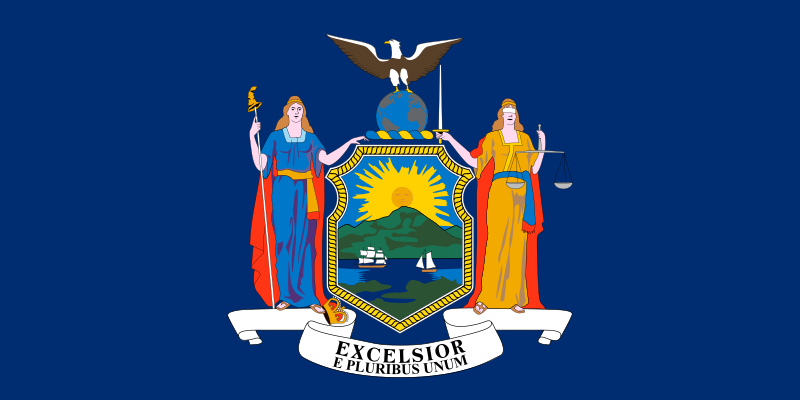
This is the current Minnesota State Flag. It features the State Seal in the center of a blue background. Since the seal is the main design feature, we will first learn how it was designed and chosen.
Territorial Seal
When the Minnesota Territory was created in 1849, it was necessary by law to have a seal. The seal is the final step taken to make any government documents official. A committee of lawmakers collected potential designs and actually chose one that depicted a native family offering a peace pipe to a white settler. Unfortunately, a majority of lawmakers were subscribers to the idea of ‘Manifest Destiny’ that had taken hold just 4 years prior. They didn’t see a future with Native Americans anywhere in it, since it was the white man’s destiny to spread their dominion across the whole continent. The design depicting an equal relationship between Native Americans and white settlers was rejected.
Henry Sibley, who was at that time the Territorial Representative to Congress, picked a different design. He chose a drawing submitted by Seth Eastman, an artist and commanding officer at Fort Snelling. His design showed a white settler plowing a field beside the Mississippi River near the Falls of St. Anthony. In the background a Native warrior on horseback, spear in hand, gallops away to the west. The farmer’s ax and gun rest on a tree stump in the foreground, yet the design is supposed to convey that the Native Americans left Minnesota voluntarily.
The artist’s wife, Mary Henderson Eastman, wrote a poem to go along with the seal, clearly expressing the meaning of his design.


This design was approved by the Territorial Legislature and put into use - but a couple of mistakes happened in the process. Because of how a seal is made, like a stamp, the design is supposed to be reversed in the carving so it appears the right way when used. The seal makers failed to do so and in the Territorial Seal the warrior is seen inexplicably riding off to the east. Also, the latin motto that was chosen for the territory - "Quae sursum volo videre" (translation: “I wish to see what is beyond”), was misspelled. Instead, the nonsensical "Quo sursum velo videre" was put in its place. It sort of translates to “I cover to see what is above.” Oops.
State Seal
In 1858, when Minnesota became a state, by law it was necessary to designate a State Seal. Unfortunately, the political parties at the time were locked in such hatred for each other that they were barely able to complete a State Constitution. Two weeks after Minnesota was officially entered into the union, the Secretary of State - the person who actually uses the seal - pointed out that he could not conduct official business until he had one.
Now the Governor, Sibley had design options for the state seal. Several had been submitted and a Senate committee had narrowed down the choices to those created by Robert Ormsby Sweeny and Louis Buechner. Their versions of the seal showed the warrior and the white farmer more equally and no weapons are present. Instead the focus is on St. Anthony Falls, the iconic trees that covered the northern part of the state, the steamboats that traveled the Mississippi and the gallions that traveled Lake Superior.


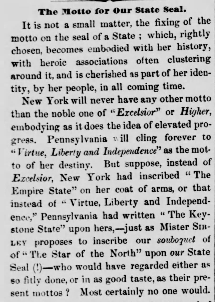
Instead, Sibley kept the “Manifest Destiny” design of the Territorial Seal, but also took the opportunity to make a few little changes of his own. He flipped the design so now the warrior was indeed riding off into a western sunset. The phrase "The Great Seal of Minnesota, 1849" was changed to "The Great Seal of the State of Minnesota, 1858". Both were minor changes that corrected the design. However, unilaterally and controversially, Sibley replaced the useless latin motto with “L’Etoile du Nord” - The Star of the North.

Sibley’s sneaky seal wasn’t even noticed until almost three months later when the engraver chosen to create the seal advertised it in the newspapers. Surprisingly, the part of the design that people took the most issue with was the motto, “L’Etoile du Nord”.
We have since embraced the starry nickname as a part of Minnesota culture, but Sibley’s contemporaries were enraged. Not only had Sibley chosen a self-aggrandizing phrase, he had chosen to express it in French. Newspaper editorials abounded about how disgusting and embarrassing a choice it was. It would be mispronounced, it was egotistical, it wasn’t English, it wasn’t Latin, it wasn’t Dakota, Ojibwe or Winnebago. (You read that right, they actually preferred any native language to French). But the issue quickly died down and the seal was put into use, effectively making it officially sanctioned. It was formally accepted by the legislature in 1861.


The Minnesota State Flag
Although the design of the State Seal was a rushed affair, decisions about the State Flag took much, much longer. It wasn’t until 1891, 33 years after gaining statehood, that the legislature decided to even think about the flag. (In their defense, they had been rather busy focusing on the Civil War and the Dakota War instead).
It had just been announced that Chicago would be the site of the World’s Fair in 1893. Of course Minnesota planned to create an exhibition at the Fair to advertise its accomplishments and opportunities. A “Women’s Auxiliary Board” was created to do most of the planning. As part of the display, it was assumed that the state should be designated with an official flag. A six-woman subcommittee was created and they chose a design submitted by the artist Amelia Hyde Center.
Center’s design was based on an unofficial flag that was carried by several regiments of the Minnesota Army during the Civil war. During the war it had become customary for Union soldiers to carry blue flags with their State Seal in the center. Center’s version featured the State Seal on both sides, one side blue and one side white. She added 19 stars, representing Minnesota as the 19th state admitted to the Union after the original 13 colonies. Pink and white lady slippers–the state flower of Minnesota–surrounded the seal. She added the gold fringe around the edge and three dates: 1819 (the year Fort Snelling was built), 1858 (the year of statehood), and 1893 (the year the flag was adopted).
The flag was embroidered by sisters Thomane and Josephine Fjelde and displayed proudly at the World’s Fair. Over 20,000 Minnesotans traveled to the Windy City to march through the streets and celebrate Minnesota’s accomplishments. Fair officials noted that Minnesota Day was among the best attended days of the Fair. The flag was enthusiastically received and even won the Fjelde sisters a gold medal for their embroidery skills.


Continued Evolution
In 1957, as mass production became popular, the intricate design was simplified for the machines and the flag became blue on both sides.
As the Civil Rights Era of the 1960s blossomed, so did renewed concerns about the meaning behind the design of the State Seal and therefore the State Flag. In 1968, the Minnesota Human Rights Commission asked the state government to design a seal that Minnesotans, Native and non-Native, could feel proud of. In response, the Secretary of State adopted a new seal in 1971 that replaced the Native American with a white man - completely wiping Native Americans from the portrayed history of the state. This seal never made its way onto the flag.
In 1983, the legislature acted to codify and standardize the seal and flag. The Native American rider was returned, but this time his horse was angled in a direction towards the south, supposedly softening the idea of them being forced out of the state, and that’s the seal and flag we have been using ever since.


In 2001, the North American Vexillological Society (vexillology is the study of flags) ranked Minnesota’s flag as one of the ten worst flag designs in the U.S. and Canada. According to the survey, the flag has too many symbols and too much information to be understood at a distance. Another problem with the flag is that it looks too similar to the other 15 states that also use their State Seal on a blue background. Turns out, Minnesota isn’t the only state proud of their Union victories during the Civil War.


Those in favor of the change say it's time to finally right this wrong. Technological advances will make changing the design digital instead of manual and therefore less costly. More tribal members in office at the capitol makes it untenable to continue wearing the State Seal on pins to denote their status. Would you want to wear a pin that commemorates the attempted genocide of your ancestors?
Still opposition exists. The official response to the current bills states: “Rebranding a state under pressure from nonprofits and select demographics is unfair. The current state flag and seal represents Minnesota’s beauty and placement at the head of the Mississippi by inclusion of St. Anthony Falls, incorporates the United States Constitutional rights including the right to keep and bear arms, optimal use of natural resources and creativity to advance technologies in milling for the benefit of the world while finding a way to co-exist side-by-side from one day to the next.”
Another high ranking state office holder said, "This is our flag. Love it or hate it or whatever you want to think about that, it still is our flag". (I don’t think they realize how many times it has already been changed.)
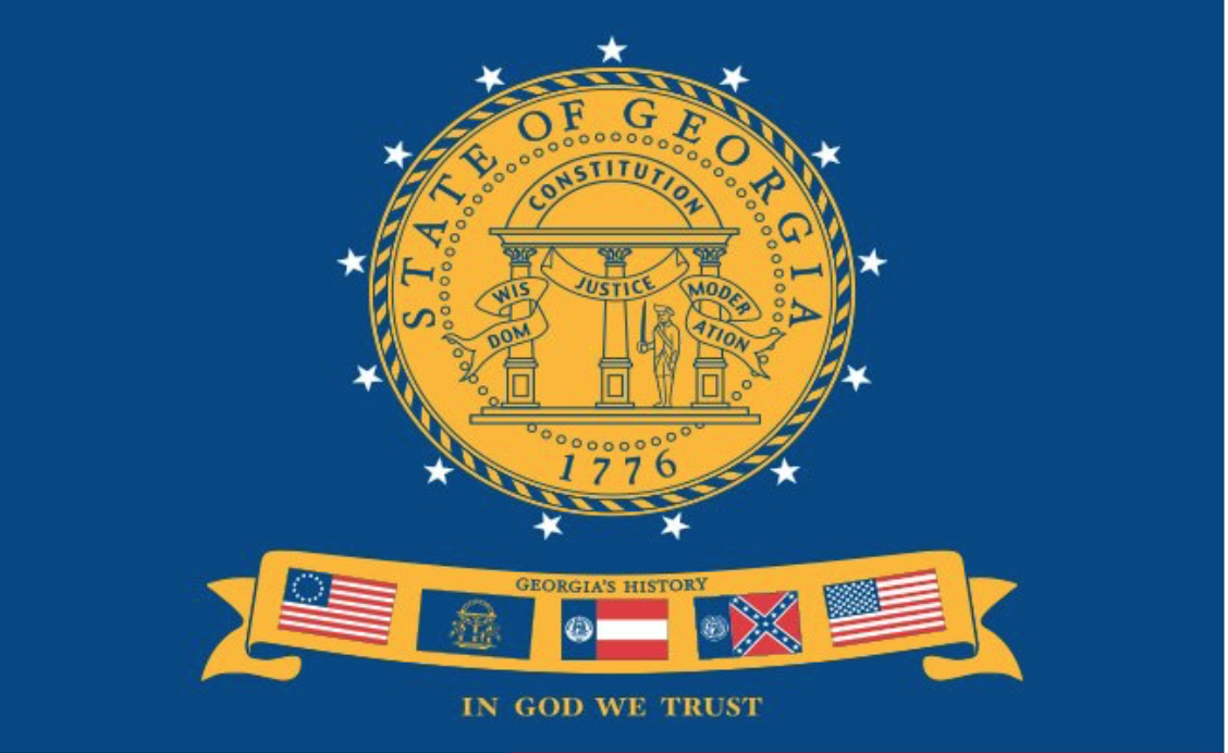
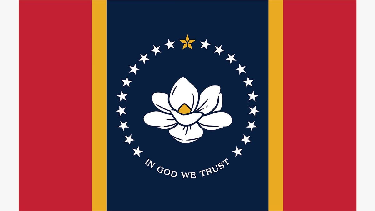
Also, it is not that unusual for a state to redesign their flag. Mississippi finally ditched the Confederate flag symbol in 2020. Louisiana made subtle changes to their design in 2010. Georgia has gone through several iterations in 1956, 2001 and 2003. Oklahoma redesigned their flag in 1924. Florida made a major upgrade in 1900.


In 1989, a bipartisan effort to redesign the seal and flag was begun again in Minnesota by Rep. Gil Gutneckt and Rep. Wayne Simoneau. A new design, nicknamed the North Star Flag, was brought to committee but was unsuccessful. Twelve more attempts to kickstart a redesign have been brought up since 2000.
As of February 24, 2023, the bill has been sent to the Ways and Means Committee for its next steps. After designs are selected, they will be opened up for public comment.
The committee to collect designs hasn’t even been formed yet, but here are some of the possible designs that have been proposed online.


The movement to redesign the flag and seal isn’t going to just go away. It’s time for both sides to come together in good faith and find a way to represent our state in a way that all of its residents can feel proud of. There is absolutely no way to make everyone happy, but this is a powerful moment for Minnesotans to reflect and decide how we want to be recognized by the world.